Instagram, a compromise in good UX for simple UI
Instagram started growing on me as Twitter and Facebook both became places where I’d only share specific type of content. A few months ago I got an iPhone 5 and have been quite active on Instagram. But I hate the app’s UI. The UX is simple and perhaps the conflict between simple UX and good UI makes itself evident. Here are few examples.
1. When was the image taken:

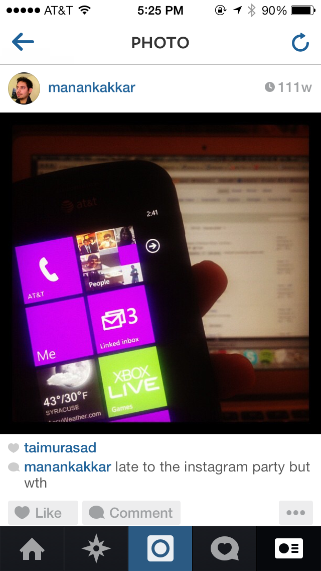
Clearly 111w is very useful to a human. I only wish my Math was so damn good that I could calculate when the images were taken without WolframAlpha. Then again, how would you show the date & time – and that’s conflict 1.
Instagram shows" 3h" which is a simple UX element but the moment you go more, say 30d, it loses its value. And showing date any other way affects the simple UI.
2. Opening an image:
The first time I used Instagram I tried tapping the image once to “open” it, it didn’t. I then double-tapped hoping that...